Checkpoints
Connect to dataset from looker studio
/ 100
Create a report in Looker Studio
- Activity overview
- Scenario
- Setup
- Task 1. Set up your temporary Looker Studio Account
- Task 2. Connect a data source to Looker Studio
- Task 3. Visualize the top five browsers used by website visitors
- Task 4. Create a scorecard to display the total number of unique visitors
- Task 5. Visualize the transactions during Jazzy July campaign
- Task 6. Identify the location of visitors by country
- Task 7. Prepare the report to share with others
- Conclusion
- End your lab
 IMPORTANT:
 Make sure to complete this hands-on lab on a desktop/laptop only.
 There are only 5 attempts permitted per lab.
 As a reminder – it is common to not get every question correct on your first try, and even to need to redo a task; this is part of the learning process.
 Once a lab is started, the timer cannot be paused. After 1 hour and 30 minutes, the lab will end and you’ll need to start again.
 For more information review the Lab technical tips reading.
Activity overview
Cloud data analysts use reports to share insights and help users make the most of their data. Looker Studio is a cloud-based business intelligence tool that turns data into informative and fully customizable reports.
To get started with Looker Studio, you need to connect to a data source. This can be a database, spreadsheet, cloud storage bucket, or API. Once you have connected to a data source, you can select the dimensions and measures that you want to use in your report. In Looker Studio, measures are called metrics.
Dimensions are qualitative attributes of data, such as campaign name, product category, or customer location. Measures are quantitative values that you can use to measure data, such as total visitors, sales revenue, or customer satisfaction.
Reports present information and insights derived from your data. You can add charts, graphs, maps, and tables to your reports to visualize data and share insights.
In this lab activity, you'll use Looker Studio to build charts and a scorecard using dimensions and measures. You’ll then combine these elements into a marketing campaign performance report that will help identify ways the marketing campaign can improve their efforts.
Scenario
Martina, the head of marketing, wants to improve the company’s marketing efforts and make them more cost effective.
To support these efforts, Martina has asked you, a member of the data team, to develop a marketing campaign performance report using historical data. The report should focus on past performance in key areas where Martina believes marketing can be more effective.
Martina has identified four key areas where they believe past performance can help the marketing team identify trends and areas for improvement.
First, Martina has asked you to identify the five most popular browsers used by visitors to the website. This information can be used to help the marketing team understand more about how visitors reach the site and better target their advertising to the browsers used most.
Second, Martina has asked you to identify the total number of unique visitors. This data can be used to track the overall growth of the website's audience and to help the team decide how to best allocate resources and improve your website's performance.
Next, Martina has asked you to identify transactions completed during the annual Jazzy July campaign. This data can be used to assess campaign effectiveness and identify areas for growth.
Finally, Martina has asked you to identify visitor locations across the globe. This data can be used to identify the company's key markets and develop targeted marketing campaigns to improve the company’s reach in the global marketplace. For this report, you will be working with web traffic data from Google Analytics (GA4) for 2017. The GA4 data already exists in BigQuery.
Here’s how you'll do this: First, you’ll set up a temporary Looker Studio environment. Second, you’ll connect to the Google Analytics (GA4) data set. Third, you’ll use a bar chart to visualize the top five browsers used by visitors to the website. Fourth, you’ll create a scorecard to display the total number of visitors to the website in 2017. Then, you’ll identify the location of visitors by country. Finally, you’ll prepare the report to share with others.
Setup
Before you click Start Lab
Read these instructions. Labs are timed and you cannot pause them. The timer, which starts when you click Start Lab, shows how long Google Cloud resources will be made available to you.
This practical lab lets you do the activities yourself in a real cloud environment, not in a simulation or demo environment. It does so by giving you new, temporary credentials that you use to sign in and access Google Cloud for the duration of the lab.
To complete this lab, you need:
- Access to a standard internet browser (Chrome browser recommended).
- Time to complete the lab---remember, once you start, you cannot pause a lab.
How to start your lab and sign in to the Google Cloud console
-
Click the Start Lab button. On the left is the Lab Details panel with the following:
- Time remaining
- The Open Google Cloud console button
- The temporary credentials that you must use for this lab
- Other information, if needed, to step through this lab
Note: If you need to pay for the lab, a pop-up opens for you to select your payment method. -
Click Open Google Cloud console (or right-click and select Open Link in Incognito Window) if you are running the Chrome browser. The Sign in page opens in a new browser tab.
Tip: You can arrange the tabs in separate, side-by-side windows to easily switch between them.
Note: If the Choose an account dialog displays, click Use Another Account. -
If necessary, copy the Google Cloud username below and paste it into the Sign in dialog. Click Next.
You can also find the Google Cloud username in the Lab Details panel.
- Copy the Google Cloud password below and paste it into the Welcome dialog. Click Next.
You can also find the Google Cloud password in the Lab Details panel.
- Click through the subsequent pages:
- Accept the terms and conditions
- Do not add recovery options or two-factor authentication (because this is a temporary account)
- Do not sign up for free trials
After a few moments, the Console opens in this tab.
Task 1. Set up your temporary Looker Studio Account
In this task, you’ll set up your temporary Looker Studio account to complete the lab.
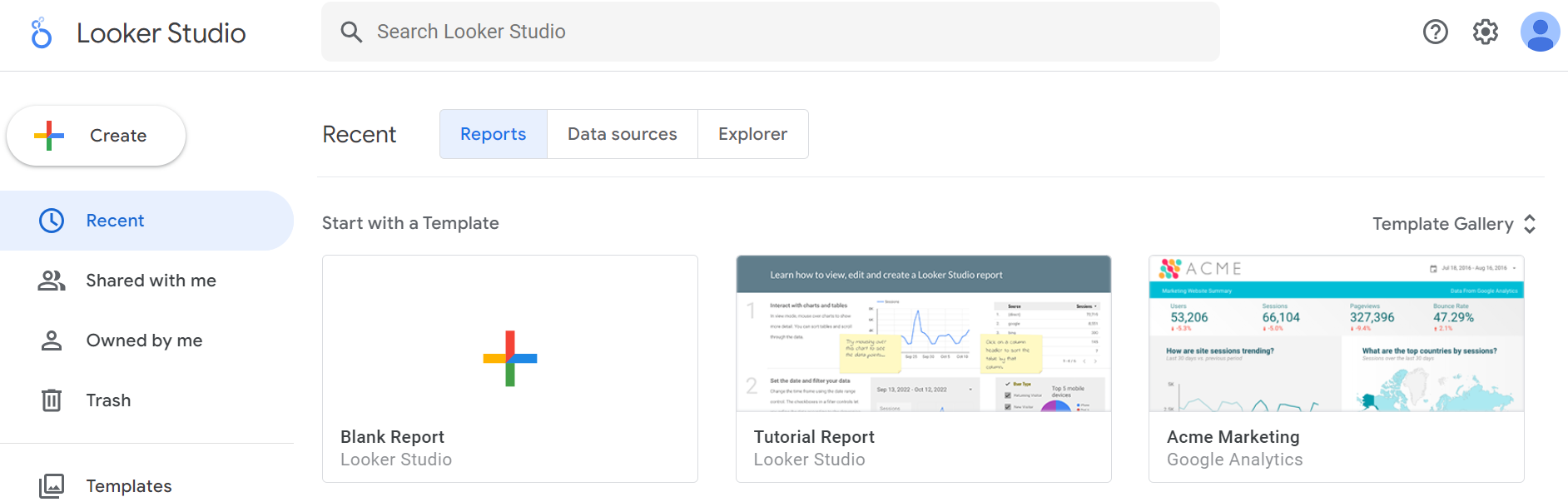
- In the same incognito window that you've opened to run this lab, click on a new tab and open Looker Studio.
- In the Start with a Template section, select Blank Report.
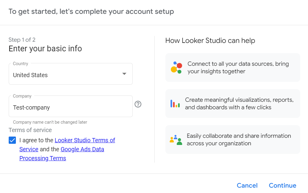
The To get started, let's complete your account setup dialog opens.
- In the Enter your basic info section:
- Expand the Country dropdown list and select your country.
- In the Company field, type Test-company.
- In the Terms of service section, select the checkbox to agree with the terms.
- Click Continue.
- When prompted to select which updates you want to receive, select No for each answer.
- Click Continue. If the Continue button is not visible, zoom out to view the bottom of the screen.
Task 2. Connect a data source to Looker Studio
In this task, you must establish a connection to the pre-created source dataset from Looker Studio.
- Click on the Untitled report you've just created.
- Locate the Add data tab.
- In the Google Connectors section, select BigQuery, and click Authorize. A table displays on the Add data to report tab.
- In the first column of the displayed table, select Recent Projects. The Project column displays.
- In the Project column, select the project id which displays as
. The project id is a string of numbers and letters and is unique to your lab. - In the Dataset column, select ga_360_sessions.
- In the Table column, select ga_sessions.
- Click Add. It may take a moment to add the data source. This is normal.
- In the pop-up dialog, click Add to report. The Untitled Report opens.
- Review the property panels. Property panels are used to configure the components in your report. The current panels displayed are Chart and Data. If the Chart panel is not visible, click on the existing table to display it.
- Delete the table from the canvas by clicking on the table and pressing the DELETE key. The associated chart property panel will also be deleted.
Click Check my progress to verify that you have completed this task correctly.
Task 3. Visualize the top five browsers used by website visitors
Martina has asked you to identify the top five browsers used by visitors to access the website.
In this task, you'll create a visualization that displays all visitors by browser in a bar chart.
- To make sure no objects are selected, click on the background of the Untitled Report canvas.
- In the Untitled Report toolbar, expand the Add a chart dropdown menu.
- Under Bar, hover over the icons to view the names of the chart and select the Bar chart option.
- Click on an empty section of the report to drop the bar chart onto the canvas.
- On the Data panel, in the ga_sessions section, find the device.browser field in the list.
- Drag it to the Dimension section on the Chart panel. This will replace the default trafficSource.referralPath with the device.browser dimension. The bar chart displays the device.browser information.
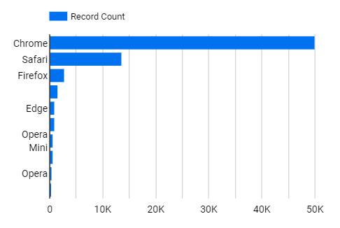
- In the Chart properties panel, click the Style tab. Under Bars, click the down arrow to set the number of bars to 5.
Next, create a new metric (measure).
- In the Data panel, click on Add a field.
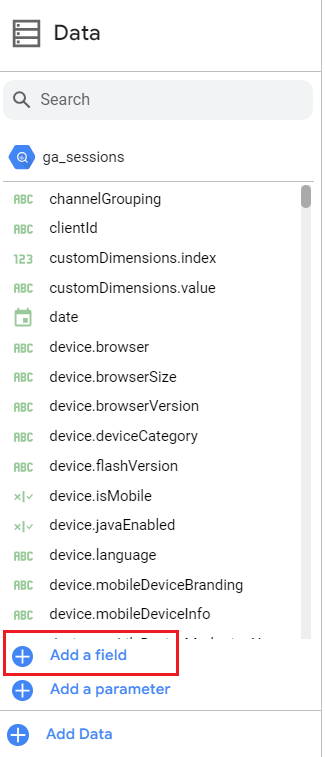
The All Fields dialog opens.
- For Field Name, type Total Visitors.
- In the Formula section, type COUNT_DISTINCT(fullVisitorId).
- Scroll down and click Save.
- Click Done.
- On the Data panel, scroll down to Total Visitors. This is the new field you've created.
- In the Chart properties panel, click the Style tab.
- From the Data panel, click and drag the Total Visitors field to replace the Record Count field in the Metric section of the Chart panel. The bar chart updates to display the total number of visitors by web browser.
Task 4. Create a scorecard to display the total number of unique visitors
Martina has also asked you to identify the total number of unique visitors to the website. In this task, you’ll create a scorecard to display a single, summary statistic.
- In the Untitled Report toolbar, expand Add a chart.
- In the Scorecard section, select Scorecard.
- If the Total Visitors metric is not in the metric section of the Chart panel, scroll to and drag the Total visitors field to replace the existing metric.
The total number of visitors across all browsers should display.
Task 5. Visualize the transactions during Jazzy July campaign
Martina wants to know the total number of transactions during the Jazzy July campaign. In this task, you’ll create a line graph that displays the transactions made between July 1 and July 14, 2017.
- In the Untitled Report toolbar, expand the Add a chart dropdown menu, and select the Time Series chart option.
- Click on an empty section of the report to drop the line chart on the canvas.
- From the Data panel, drag date to the Dimension section of the Chart panel (if it's not already there). The line chart displays dates from July 1 to July 31 in 2017 on the x-axis.
Next, create a new measure.
- In the Data panel, click on Add a field. The All Fields dialog opens.
- For Field Name, type Number of Transactions.
- In the Formula section, enter COUNT_DISTINCT(hits.item.transactionId).
- Scroll down and click Save.
- Click Done.
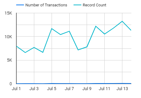
- From the Data panel, drag Number of Transactions to the Metric section of the Chart panel. Do not replace the metric that's already there.
- On the Chart panel, scroll to the Default date range section, select Custom, and choose the data range from 1 July 2017 to 14 July 2017. The line chart displays the updated date range on the x-axis.
Task 6. Identify the location of visitors by country
In this task, you must create a table visualization to display all of the countries where the website is active and the number of visitors from each of them.
- In the Untitled Report toolbar, expand the Add a chart dropdown menu, and select the Table option.
- Click on an empty section of the report to drop the table onto the canvas.
- From the Data panel, drag geoNetwork.country to the Dimension section of the Chart panel. The table displays the geoNetwork.country information.
Next, add the total page views for each country.
- From the Data panel, drag totals.pageviews to the Metric section of the Chart panel. If other metrics are displayed in the Metric section, delete those using the x alongside each additional dimension listed.
Notice that the default aggregation for totals.pageviews is sum. The table displays the sum of page views by country.
Now, add an advanced filter.
- In the toolbar, select Insert > Advanced filter.
- Click on an empty section of the report to drop the advanced filter element onto the canvas.
- From the Data panel, drag geonetwork.country to the Control Field section of the Chart panel.
Finally, practice adding a condition to the filter to match a country name. For this example use Brazil.
- On the Control panel, in the Control field section, expand the Search type dropdown and select Starts with. Notice the change in the geoNetwork.country advanced filter element.
- In the advanced filter element, in the Enter a value field, type br, and press ENTER.
- Select Brazil.
The total number of page views to the website in Brazil should be displayed.
Task 7. Prepare the report to share with others
In this task, you’ll prepare the report and preview how it will display when shared with others.
- Click on the report name, currently Untitled Report.
- Enter a new descriptive name that will help users understand the report's data.
- In the toolbar, locate the Text icon. Use the text icon to add the descriptive name to the top of the canvas. Feel free to experiment with lines and shapes to further customize your report.
- Click the View button to exit the edit mode, and review how your users will view the report.
Conclusion
Great work!
You created a dashboard using Looker Studio to help Martina better understand the web traffic data from Google Analytics (GA4) so that they can improve the company’s marketing efforts and make them more cost effective.
First, you practiced connecting a data source to a visualization tool.
Then, you created a visualization that displayed all visitors by browser in a bar chart.
Next, you created a line graph that displayed the total number of transactions made over a specific timeframe.
Finally, you created a table to display all the countries where the website is active and the number of visitors for each country.
With this dashboard, Martina will have an interactive way to understand their data and make data-driven decisions.
Congratulations! You're well on your way to learning how to use Looker Studio to visualize and derive insights from your data.
End your lab
Before you end the lab, make sure you’re satisfied that you’ve completed all the tasks. When you're ready, click End Lab and then click Submit.
Ending the lab will remove your access to the lab environment, and you won’t be able to access the work you've completed in it again.
Copyright 2024 Google LLC All rights reserved. Google and the Google logo are trademarks of Google LLC. All other company and product names may be trademarks of the respective companies with which they are associated.