


准备工作
- 实验会创建一个 Google Cloud 项目和一些资源,供您使用限定的一段时间
- 实验有时间限制,并且没有暂停功能。如果您中途结束实验,则必须重新开始。
- 在屏幕左上角,点击开始实验即可开始
Create a chart
/ 25
Create a scatter chart and combo chart
/ 40
Use the SPARKLINE function
/ 25
Publish a spreadsheet
/ 10
在本實驗室中,您將支援一家虛擬公司,透過完成多項實驗室活動,協助該公司員工運用 Google 試算表。
Thomas Omar 和 Seroja Malone 創立了小型家庭烘焙坊 On the Rise Bakery,販售多國風味與懷舊烘焙製品。他們從美國紐約市發跡,並拓展至北美洲各地,目前在全球多處都設有分店。隨著公司規模擴大,他們在多間分店聘請員工來監督每日營運情形。
Google 試算表有數項內建工具,能讓使用者輕鬆建立及分享實用的圖表和報表,迅速以視覺化方式呈現資料,且不必離開試算表。
在本實驗室中,您將製作圖表,協助 On the Rise Bakery 以視覺化方式呈現營業據點與銷售資料。
您將瞭解如何執行下列工作:
如果您剛接觸 Google 試算表,建議先修習下列課程:Google Sheets 與 Google Sheets - Advanced Topics。
以下實驗室也有助於您快速上手:Google 試算表:開始使用。
請詳閱下列操作說明。實驗室活動會計時,而且無法暫停。點選「Start Lab」後就會開始計時,並顯示您可以使用 Google Workspace 資源多久。
您會在實際雲端環境完成這個 Google Workspace 實作實驗室的活動,而非模擬或示範環境。您會取得新的臨時憑證,可以在實驗室活動期間登入及存取 Google Workspace。
如要完成這個研究室活動,請先確認:
準備好時,點選左上方面板的「Start Lab」。
「實驗室詳細資料」窗格會顯示,您在這個實驗室登入 Gmail 時,必須使用的暫時憑證。
如果實驗室會產生費用,畫面會出現選擇付款方式的彈出式視窗。
點選「Open Google Drive」。
接著,實驗室會啟動相關資源,並開啟另一個分頁,顯示「登入」頁面。
提示:您可以在不同的視窗並排開啟分頁。
如有必要,請將下方的 Username 貼到「登入」對話方塊。
點按「下一步」。
複製下方的 Password,並貼到「歡迎使用」對話方塊。
點按「下一步」。
顯示提示時,請同意所有條款及細則。
Google 雲端硬碟隨即開啟,您會登入學員 Google 帳戶。
在這項工作中,您將建立及自訂顯示 On the Rise Bakery 營業據點的圖表。
在實驗室操作說明的左側面板中,對「開啟 Google 雲端硬碟」按一下滑鼠右鍵,點選「在無痕視窗中開啟連結」,然後登入實驗室學員帳戶。
在 Google 雲端硬碟的右上角,依序點選「設定」圖示 
找到「將上傳的檔案轉換成 Google 文件編輯器格式」,勾選旁邊的方塊。
在設定頁面的左上角,點選返回箭頭,回到 Google 雲端硬碟首頁。
點選「On the Rise Bakery Sales and Locations」,下載試算表。
在左側窗格,依序點選「新增」>「檔案上傳」。
選取電腦上名為 On the Rise Bakery Sales and Locations.xlsx 的檔案。
看到右下角顯示「上傳完成」訊息時,就表示檔案上傳成功。
按兩下新上傳的檔案,開啟該檔案,然後退出「Google 雲端硬碟」分頁。
在「Locations」工作表中,點選 E 欄的灰色欄標籤,即可選取該欄的所有項目。
在頁面頂端,依序點選「插入」>「圖表」來建立圖表。
此時畫面上應該會出現一個圓餅圖。
(選用) 點選圖表,然後拖曳藍色標記來調整大小。
您可以透過圓餅圖,比較單一資料序列中各部分資料相較於整體資料的差異。使用圓餅圖時,資料類別最好不要超過五種。如果想要呈現確切資料值,請勿使用圓餅圖,因為角度和面積差異可能會難以理解。
在「圖表編輯器」窗格的「圖表類型」下,選取「柱狀圖」。
Google 試算表會自動根據資料特性,提供圖表類型建議,但您不一定要使用建議的選項。
如要變更圖表外觀,請點選「自訂」分頁標籤。
展開「圖表標題和軸標題」專區,然後將圖表標題變更為「Locations by Continent」。
展開「系列」專區,然後點選「設定資料點格式」旁的「新增」。
在「選取資料點」對話方塊的「資料點」下,選取「Continent:South America」,然後點選「確定」。
將這個資料點的顏色變更為紫色。
在「圖表編輯器」窗格中向下捲動,然後展開「格線與刻度」專區。
在第一個下拉式選單中選取「縱軸」,然後勾選「次要格線」核取方塊。
退出「圖表編輯器」。
您可以使用柱狀圖呈現一或多種資料類別或群組,尤其是各類別底下還有子類別時,這種圖表更能清楚呈現資料。
點選「Check my progress」,確認目標已達成。
在這項工作中,您將根據 On the Rise Bakery 南美營業據點的銷售資料,建立組合圖和散布圖。
在試算表的左下角,點選標示為 Sales - South America 的工作表。
選取儲存格 A1 至 M3 這個範圍,然後在頁面頂端依序點選「插入」>「圖表」。
此時應該會出現一個折線圖。您可以透過折線圖觀察一段時間內的資料走向。
在「圖表編輯器」窗格的「圖表類型」下,選取「組合圖」。
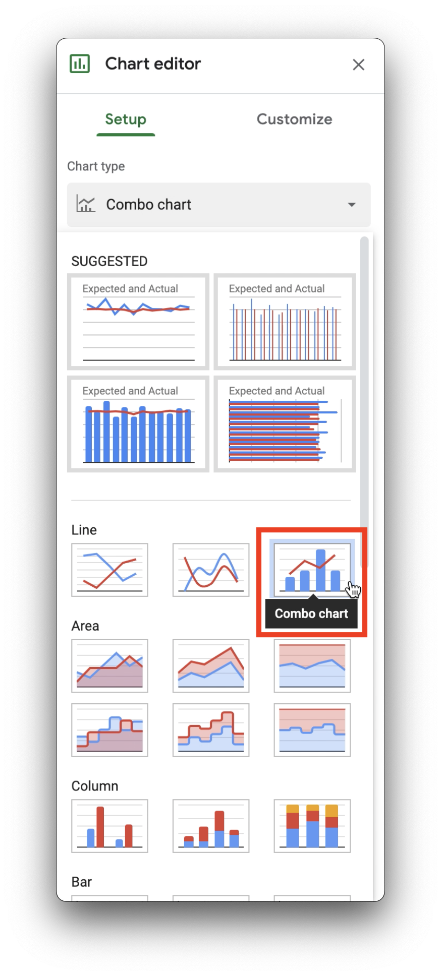
您可以透過組合圖使用折線和長條呈現不同的資料序列。
選取儲存格 A1 至 M3 這個範圍,然後在頁面頂端依序點選「插入」>「圖表」。
此時應該會出現第二個圖表,疊在現有圖表上。
請移動圖表,確保兩個圖表都看得到。
在「圖表編輯器」窗格的「圖表類型」下,選取「散佈圖」。
您可以使用散布圖呈現橫軸 (X 軸) 及縱軸 (Y 軸) 上的數字座標。散布圖可顯示某個變數受另一個變數影響的程度。
點選「Check my progress」,確認目標已達成。
Google 試算表能建立的圖表有很多種,您在工作 1 和 2 建立的只是其中的幾種。如要進一步瞭解 Google 試算表的圖表與圖形,請參閱這篇文章。
在這項工作中,您將為 On the Rise Bakery 建立走勢圖和進度列,以便協助員工迅速查看資料。
走勢圖是顯示於單一儲存格內的小型圖表。
在 B 欄的灰色標籤上按一下滑鼠右鍵,然後選取「向左插入 1 欄」。
工作表中就會出現一個空白的資料欄。
如要建立走勢圖,請在儲存格 B2 輸入或貼上 =SPARKLINE(C2:N2)。
SPARKLINE 函式唯一需要的引數是資料,如本練習所示,這能以儲存格範圍的形式提供。您也可以不要指定範圍,而是以陣列的形式提供資料,例如 =SPARKLINE({500,100,200,400,300})。
如要進一步瞭解如何在 Google 試算表中使用陣列,請參閱這篇文章。
On the Rise Bakery 想追蹤該年第一季 (1 月至 3 月) 過後,他們對於年度銷售目標 ($2,400,000 美元) 的達成進度。您可以使用 SPARKLINE 函式搭配選用的設定,建立進度列。
在儲存格 B3 輸入或貼上 =SPARKLINE(SUM(C3:E3)/2400000,{"charttype", "bar"; "max", 1; "min", 0; "color1", "blue"})。
第一個引數是以第一季銷售額除以年度銷售目標。彩色橫條的寬度代表年度目標的達成進度。
SPARKLINE 函式有選用參數,能讓您使用陣列指定許多屬性,包括:圖表類型、最大值、最小值和顏色。
變更儲存格 B3 中的公式,將進度列的顏色從 blue 改成 green。
指定陣列中的各個選項時,均須採用以半形逗號分隔的組合。第一個字詞是選項名稱,如 "charttype",第二個屬性則是該選項的設定值,如 "bar"。陣列中定義的各個選項皆以半形分號分隔。
點選「Check my progress」,確認目標已達成。
選項和資料引數差不多,也能以範圍的形式指定。如要進一步瞭解 SPARKLINE 的可用選項,請參閱這篇文章。
在這項工作中,您會將試算表發布為專屬網頁 (有自己的網址),並在 Google 簡報檔案中連結圖表。
發布選項能讓您以獨特的簡易網頁形式分享檔案副本。您可以控制系統是否要自動重新發布該網頁,反映你所做的變更,還可限制只有特定網域能存取。
 使用試算表資料」。
將圖表或表格插入 Google 簡報檔案或 Google 文件時,可以將其連結至現有檔案。
點選「Check my progress」,確認目標已達成。
在本實驗室中,您透過圓餅圖和柱狀圖以視覺化方式呈現資料、使用圖表編輯器自訂圖表、建立內嵌圖表,以及在試算表中發布圖表。
如要進一步瞭解 Google 試算表,請參考下列資源:
協助您瞭解如何充分運用 Google Cloud 的技術。我們的課程會介紹專業技能和最佳做法,讓您可以快速掌握要領並持續進修。我們提供從基本到進階等級的訓練課程,並有隨選、線上和虛擬課程等選項,方便您抽空參加。認證可協助您驗證及證明自己在 Google Cloud 技術方面的技能和專業知識。
使用手冊上次更新日期:2024 年 2 月 20 日
實驗室上次測試日期:2023 年 3 月 10 日
Copyright 2025 Google LLC 保留所有權利。Google 和 Google 標誌是 Google LLC 的商標,其他公司和產品名稱則有可能是其關聯公司的商標。


此内容目前不可用
一旦可用,我们会通过电子邮件告知您

太好了!
一旦可用,我们会通过电子邮件告知您
一次一个实验
确认结束所有现有实验并开始此实验