GSP1011

Overview
Flutter is Google's UI toolkit for building beautiful, natively compiled applications for mobile, web, and desktop from a single codebase.
Flutter works with existing code, is used by developers and organizations around the world, and is free and open source.
In this lab, you will create a Flutter app using generated template code.
The basic Flutter interface provides a simple example to get started programming in Flutter.
What you'll learn
- How to write a Flutter app that looks natural on iOS, Android, and the web
- Basic structure of a Flutter app
- Using multiple pages
- Using hot reload for a quicker development cycle
Prerequisites
Based on the content, it is recommended to have some familiarity with:
Task 1. Open the Code Server Editor
In this lab, you will use a custom editor that includes the Flutter and Dart extensions.
From the initial lab panel:
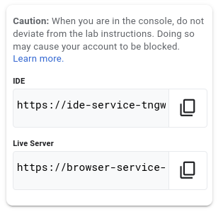
- Copy the Flutter IDE address displayed.
- Paste the Editor address into a Browser tab.
Task 2. Creating a Flutter Template
In this section create a Flutter Web application called first_app.
- Click the hamburger button (i.e. Left hand side, three horizontal lines
 ).
).
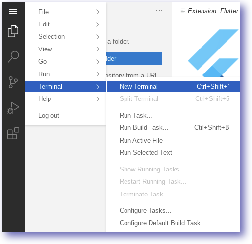
- Open a
Terminal within the browser by selecting New Terminal.
- In the terminal enter the following command:
flutter create first_app
- Move to the first_app directory:
cd first_app
- Close the terminal window:
exit
The first_app directory and template code have now been created.
Task 3. Opening the new app
In this section explore the Flutter Web application called first_app.
- Open the folder
first_app.
- Acknowledge the on-screen notifications.
At this point you will have the Flutter application open in the current workspace.
Task 4. Running the Flutter Web application
In this section run the Flutter Web application from the command line.
- In the editor, open a Terminal.
- Ensure the terminal directory is set to
first_app.
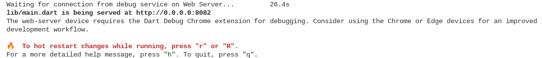
- Run the Flutter web server:
fwr
- The running web server should look similar to below:
- Copy the Flutter
Live Server address from the lab Panel.
- Paste the address into a new browser tab.
The browser will render the web application e.g.
Note: Rendering of the web application can take upto ten seconds.
The view will show the application based on the code in the editor.
Feel free to interact with the running application
Task 5. Adding Boilerplate code
In this section, replace the Flutter starter code with the example for this lab.
- Replace the contents of
lib\main.dart with the code below:
import 'package:flutter/material.dart';
// TODO: Embedded List
class GoogleProducts {
final List<String> items = [
'Cloud Functions',
'App Engine',
'Kubernetes Engine',
'Compute Engine',
'Bare Metal',
'Preemptible VMs',
'Shielded VMs',
'Sole-tenet Nodes',
'VMWare Engine',
'Cloud Firestore',
'Cloud Storage',
'Persistent Disk',
'Local SSD',
'Cloud Bigtable',
'Cloud Firestore',
'Cloud Memorystore',
'Cloud Spanner',
];
}
void main() {
runApp(const MyApp());
}
class MyApp extends StatelessWidget {
const MyApp({Key? key}) : super(key: key);
@override
Widget build(BuildContext context) {
const title = 'Google Products';
return const MaterialApp(
title: title,
debugShowCheckedModeBanner: false,
home: ProductHomeWidget(title),
);
}
}
// TODO: ProductHomeWidget
class ProductHomeWidget extends StatelessWidget {
final String title;
const ProductHomeWidget(this.title, {Key? key}) : super(key: key);
@override
Widget build(BuildContext context) {
return Scaffold(
// backgroundColor: Colors.white,
appBar: AppBar(
// backgroundColor: Colors.transparent,
// elevation: 0,
// TODO: Enable AppBarLeading
// leading: const AppBarLeading(),
// TODO: Enable AppBarLeading
// actions: const [
// AppBarActionsShare(),
// ],
title: Text(title, style: const TextStyle(color: Colors.black)),
),
// body: ProductListView(),
);
}
}
// TODO: AppBarLeading
class AppBarLeading extends StatelessWidget {
const AppBarLeading({Key? key}) : super(key: key);
@override
Widget build(BuildContext context) {
return const IconButton(
icon: Icon(
Icons.menu,
),
onPressed: null,
);
}
}
// TODO: AppBarActionsShare
class AppBarActionsShare extends StatelessWidget {
const AppBarActionsShare({Key? key}) : super(key: key);
@override
Widget build(BuildContext context) {
return IconButton(
icon: const Icon(
Icons.share,
),
onPressed: () {
const snackBar =
SnackBar(content: Text('You selected the Share Action'));
ScaffoldMessenger.of(context).showSnackBar(snackBar);
});
}
}
// TODO: ProductListView
class ProductListView extends StatelessWidget {
final googleProducts = GoogleProducts();
ProductListView({Key? key}) : super(key: key);
@override
Widget build(BuildContext context) {
return ListView.builder(
itemCount: googleProducts.items.length,
itemBuilder: (context, index) {
return ProductListTile(googleProducts.items[index]);
},
);
}
}
// TODO: ProductListTile
class ProductListTile extends StatelessWidget {
final String? productLabel;
const ProductListTile(this.productLabel, {Key? key}) : super(key: key);
@override
Widget build(BuildContext context) {
return ListTile(
title: Text('$productLabel', style: const TextStyle(color: Colors.black)),
subtitle: const Text('SubTitle', style: TextStyle(color: Colors.black)),
leading: const Icon(Icons.help_center_outlined, color: Colors.black),
// When the child is tapped, show a snackbar.
onTap: () {
// TODO: Enable onTap
// final snackBar = SnackBar(content: Text('You selected $productLabel'));
// ScaffoldMessenger.of(context).showSnackBar(snackBar);
// TODO: Navigation to the Details Page
// Navigator.push(
// context,
// MaterialPageRoute(builder: (context) => const MyDetails()),
// );
},
);
}
}
// TODO: Add a details page
// class MyDetails extends StatelessWidget {
// const MyDetails({Key? key}) : super(key: key);
// @override
// Widget build(BuildContext context) {
// const title = 'Details Page';
// return Scaffold(
// // backgroundColor: Colors.white,
// appBar: AppBar(
// iconTheme: const IconThemeData(
// color: Colors.grey, //change your color here
// ),
// backgroundColor: Colors.transparent,
// elevation: 0,
// // leading: const AppBarLeading(),
// actions: const [
// AppBarActionsShare(),
// ],
// title: const Text(title, style: TextStyle(color: Colors.black)),
// ),
// // appBar: AppBar(
// // title: const Text(title),
// // ),
// body: const Center(
// child: Text('Hello Details Page')),
// );
// }
// }
- After updating
lib\main.dart with the boilerplate code, refresh the application.
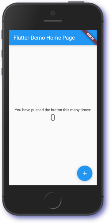
The Flutter app should now look similar to the image below:
In the next section, we outline the application we will build in this lab.
Task 6. Designing our application
In this section we use widgets to build a basic two screen application.
From the above sketch we note that our application uses the following types of widgets.
| Widget |
Description |
| AppBar |
Header bar |
| Scaffold |
Screen layout |
| Text |
Text entry fields |
| ListView |
Item list |
In the next section, we discuss the AppBar and its key properties.
Task 7. Working with AppBar
In this section you will build a basic AppBar configuration.
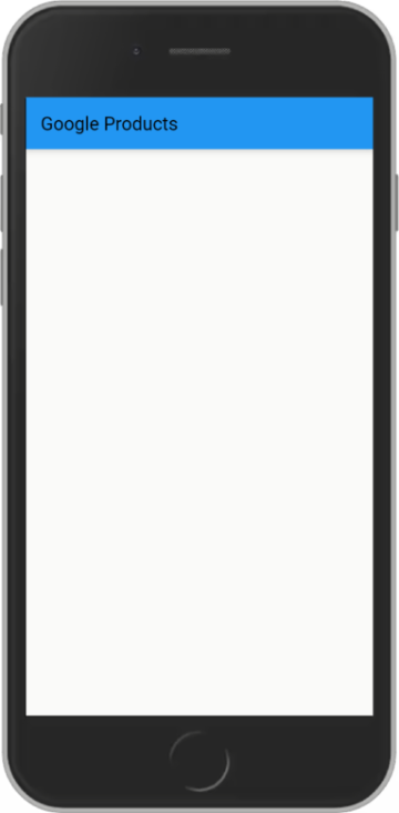
The Flutter page will look similar to the image below:
The AppBar is used to show details about the application functionality.
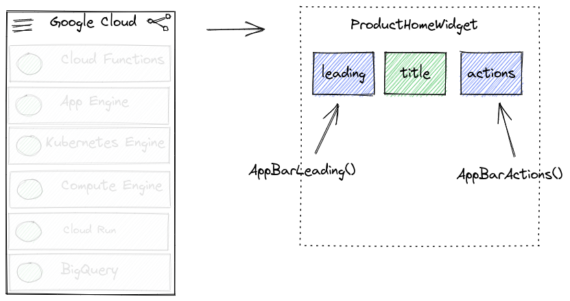
In our application we populate the AppBar with three items:
| Property |
Description |
| leading |
An icon placed at the left side of the AppBar |
| title |
A title placed on the App Bar |
| actions |
An icon placed on the right side of the AppBar |
In the next section, learn how to enhance an AppBar.
Adding AppBar icons
Update the AppBar leading setting to reference the function AppBarLeading.
- Find the following line(s) and uncomment the code (i.e. remove the
// characters):
// TODO: Enable AppBarLeading
// leading: const AppBarLeading(),
Your code should now look like this:
Widget build(BuildContext context) {
return Scaffold(
// backgroundColor: Colors.white,
appBar: AppBar(
// backgroundColor: Colors.transparent,
// elevation: 0,
// TODO: Enable AppBarLeading
leading: const AppBarLeading(),
// actions: const [
// AppBarActionsShare(),
// ],
title: Text(title, style: const TextStyle(color: Colors.black)),
),
// body: ProductListView(),
);
}
- Perform a
hot restart to review the changes to the Flutter user interface.
Note: The example uses the Icon.menu option, but you can also customize the icon used.
Adding AppBar actions
Update the AppBar actions setting to reference the function AppBarActionsShare.
- Find the following line(s) and uncomment the code (i.e. remove the
// characters):
// TODO: Enable AppBarActionsShare
// actions: const [
// AppBarActionsShare(),
// ],
Your code should now look like this:
Widget build(BuildContext context) {
return Scaffold(
// backgroundColor: Colors.white,
appBar: AppBar(
// backgroundColor: Colors.transparent,
// elevation: 0,
leading: const AppBarLeading(),
// TODO: Enable AppBarActionsShare
actions: const [
AppBarActionsShare(),
],
title: Text(title, style: const TextStyle(color: Colors.black)),
),
// body: ProductListView(),
);
}
- Perform a
hot restart to review the changes to the Flutter user interface.
Note: Actions are a great way to enhance your application.
In the above code we add a share icon.
To make this functional, we would need to add some supporting code.
Styling the AppBar
Update the AppBar setting to make it more appealing.
- Find the following line(s) and uncomment the code (i.e. remove the
// characters):
// TODO: Style the AppBar
// backgroundColor: Colors.white,
appBar: AppBar(
// backgroundColor: Colors.transparent,
// elevation: 0,
Your code should now look like this:
Widget build(BuildContext context) {
return Scaffold(
// TODO: Style the AppBar
backgroundColor: Colors.white,
appBar: AppBar(
backgroundColor: Colors.transparent,
elevation: 0,
leading: const AppBarLeading(),
actions: const [
AppBarActionsShare(),
],
title: Text(title, style: const TextStyle(color: Colors.black)),
),
// body: ProductListView(),
);
}
- Perform a
hot restart to review the changes to the Flutter user interface.
The AppBar provides a lot of options and you should continue to explore its features.
With the changes made, your application will look similar to the image below:
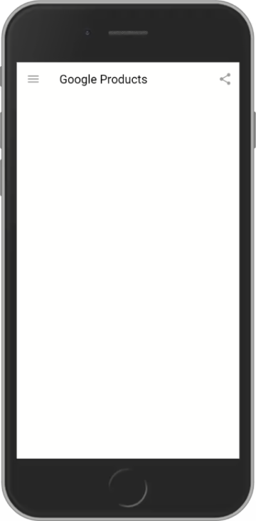
At this point our application does not show any product data.
In the next section, learn how to use a ListView to display data.
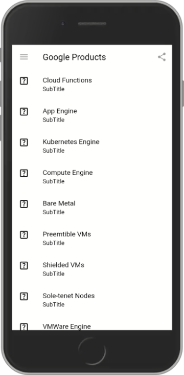
Task 8. Working with ListView
In this section use a ListView builder to show a list of items.
Data for the list is defined in a class named GoogleProducts.
Use the ListView to display the data as part of the application.
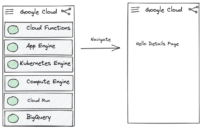
The Flutter page will look similar to the image below:
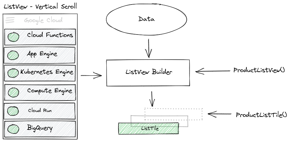
In the image a ListView is used to display Google Cloud products.
Note: Using a ListView builder requires a data source. In this example we are using an embedded list of items. However you could also use data from an Asset folder or download the data from the internet.
Read more about working with Lists in the Flutter documentation.
In this exercise below, create a long list using a ListView.builder.
- Find the following line(s) and uncomment the code (i.e. remove the
// characters):
// TODO: Enable the ListView
// body: ProductListView(),
Your code should now look like this:
Widget build(BuildContext context) {
return Scaffold(
backgroundColor: Colors.white,
appBar: AppBar(
backgroundColor: Colors.transparent,
elevation: 0,
leading: const AppBarLeading(),
actions: const [
AppBarActionsShare(),
],
title: Text(title, style: const TextStyle(color: Colors.black)),
),
// TODO: Enable the ListView
body: ProductListView(),
);
}
- Perform a
hot restart to review the changes to the Flutter user interface.
The application will show information relating to Google Cloud products in the list.
In the next section, add some interactivity to the list items.
Task 9. Adding interactivity
In this section learn how to respond when a list item is selected.
Add interactivity in Flutter typically requires a Gesture Detector.
The type of gesture used in this section is associated with the onTap method.
We want to see an on screen notification when the user registers a click on a ListView item.
A SnackBar provides a visual notification and can be used in conjunction with the onTap functionality.
- Find the following line(s) and uncomment the code (i.e. remove the
// characters):
// TODO: Enable onTap
// onTap: () {
// final snackBar = SnackBar(content: Text('You selected $productLabel'));
// ScaffoldMessenger.of(context).showSnackBar(snackBar);
// },
Your code should now look like this:
class ProductListTile extends StatelessWidget {
final String? productLabel;
const ProductListTile(this.productLabel, {Key? key}) : super(key: key);
@override
Widget build(BuildContext context) {
return ListTile(
title: Text('$productLabel', style: const TextStyle(color: Colors.black)),
subtitle: const Text('SubTitle', style: TextStyle(color: Colors.black)),
leading: const Icon(Icons.help_center_outlined, color: Colors.black),
// TODO: Enable onTap
onTap: () {
final snackBar = SnackBar(content: Text('You selected $productLabel'));
ScaffoldMessenger.of(context).showSnackBar(snackBar);
},
);
}
}
- Perform a
hot restart to review the changes to the Flutter user interface.
The ListView is now present and will be populated with Google Products.
It will also respond with a brief notification when an item is clicked.
In the next section, create a details page to show information about the product selected.
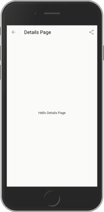
Task 10. Creating a Details page
In this section you will create a second Flutter page that will be used to display additional information.
- Find the following line(s) and uncomment the code (i.e. remove the
// characters):
// TODO: Add a details page
// class MyDetails extends StatelessWidget {
// const MyDetails({Key? key}) : super(key: key);
//
// @override
// Widget build(BuildContext context) {
// const title = 'Details Page';
//
// return Scaffold(
// appBar: AppBar(
// iconTheme: const IconThemeData(
// color: Colors.grey, //change your color here
// ),
// backgroundColor: Colors.transparent,
// elevation: 0,
// // leading: const AppBarLeading(),
// actions: const [
// AppBarActionsShare(),
// ],
// title: const Text(title, style: TextStyle(color: Colors.black)),
// ),
// body: const Center(
// child: Text('Hello Details Page')),
// );
// }
// }
Your code should now look like this:
// TODO: Add a details page
class MyDetails extends StatelessWidget {
const MyDetails({Key? key}) : super(key: key);
@override
Widget build(BuildContext context) {
const title = 'Details Page';
return Scaffold(
appBar: AppBar(
iconTheme: const IconThemeData(
color: Colors.grey, //change your color here
),
backgroundColor: Colors.transparent,
elevation: 0,
// leading: const AppBarLeading(),
actions: const [
AppBarActionsShare(),
],
title: const Text(title, style: TextStyle(color: Colors.black)),
),
body: const Center(
child: Text('Hello Details Page')),
);
}
}
Note: Working with the AppBar
Flutter will automatically manage the leading icon.
Therefore we do not need to include this option in the Details page AppBar.
If you want an Action to be present, then include the relevant action to be displayed.
Making the above changes ensures the Details AppBar has a similar look and feel to the parent page.
At this point the Details Page is not connected to the first page.
Let's correct that in the next section.
Task 11. Navigating between pages
In this section enable navigation v1 between the first and second pages.
Previously we enabled a SnackBar to indicate that an onTap event had occurred.
We will disable the SnackBar functionality and replace it with Navigation.
To achieve navigation will require the following activities:
-
Comment out the SnackBar code
-
Add a navigation between the pages
-
Point the navigation to the MyDetails class
-
Find the following line(s) and uncomment the code (i.e. remove the // characters):
@override
Widget build(BuildContext context) {
return ListTile(
title: Text('$productLabel', style: const TextStyle(color: Colors.black)),
subtitle: const Text('SubTitle', style: TextStyle(color: Colors.black)),
leading: const Icon(Icons.help_center_outlined, color: Colors.black),
// When the child is tapped, show a snackbar.
onTap: () {
// TODO: SnackBar onscreen notification
final snackBar = SnackBar(content: Text('You selected $productLabel'));
ScaffoldMessenger.of(context).showSnackBar(snackBar);
// TODO: Navigation to the Details Page
// Navigator.push(
// context,
// MaterialPageRoute(builder: (context) => const MyDetails()),
// );
},
);
}
Your code should now look like this:
@override
Widget build(BuildContext context) {
return ListTile(
title: Text('$productLabel', style: const TextStyle(color: Colors.black)),
subtitle: const Text('SubTitle', style: TextStyle(color: Colors.black)),
leading: const Icon(Icons.help_center_outlined, color: Colors.black),
// When the child is tapped, show a snackbar.
onTap: () {
// TODO: SnackBar onscreen notification
// final snackBar = SnackBar(content: Text('You selected $productLabel'));
// ScaffoldMessenger.of(context).showSnackBar(snackBar);
// TODO: Navigation to the Details Page
Navigator.push(
context,
MaterialPageRoute(builder: (context) => const MyDetails()),
);
},
);
}
Note: The onTap method is updated to add comment lines on the previously enabled snackBar.
The page navigation (i.e. the Route) now takes precedence and maps between the first and second pages when an item is pressed.
The Details Page is now connected to the first page.
At this point you will be able to move between the pages using the onscreen navigation.
Click Check my progress to verify the objective.
Assess my progress
Congratulations!
You have successfully completed the lab and demonstrated your knowledge of Flutter.
Over the course of this lab, you have performed the following tasks:
- Used a ListView widget
- Refactored code to use ListView.builder
- Added notifications to Flutter using a SnackBar widget
- Declared a new Flutter page
- Passed data between Flutter pages
This self-paced lab is part of the Flutter Essentials quest. A quest is a series of related labs that form a learning path. Completing this quest earns you a badge to recognize your achievement.
You can make your badges public and link to them in your online résumé or social media account. Enroll in this quest to get immediate credit for completing this lab.
See other available quests.
Take your next lab
Continue your quest with Implementing Page Navigation in a Flutter Application.
Manual Last Updated October 18, 2022
Lab Last Tested February 8, 2022
Copyright 2024 Google LLC All rights reserved. Google and the Google logo are trademarks of Google LLC. All other company and product names may be trademarks of the respective companies with which they are associated.