Data visualization tools can help you make sense of your BigQuery data and help you analyze the data interactively. You can use visualization tools to help you identify trends, respond to them, and make predictions using your data. In this lab, you use Looker Studio to visualize data in the BigQuery table populated by your Dataflow pipeline in the previous exercise. You will not be accessing live streaming data in this lab.
Objectives
In this lab, you will perform the following tasks:
Connect to a BigQuery data source
Create reports and charts to visualize BigQuery data
This lab uses Looker Studio to visualize data in BigQuery using the BigQuery connector. In subsequent tasks, you will create a data source, a report, and charts that visualize data in the sample table.
Setup
For each lab, you get a new Google Cloud project and set of resources for a fixed time at no cost.
Sign in to Qwiklabs using an incognito window.
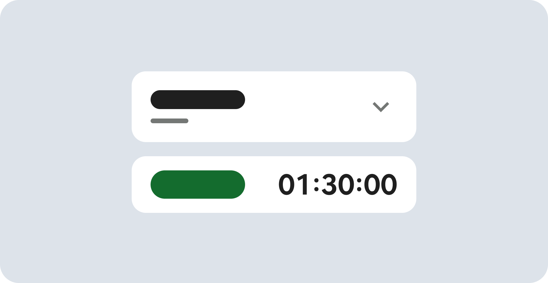
Note the lab's access time (for example, 1:15:00), and make sure you can finish within that time.
There is no pause feature. You can restart if needed, but you have to start at the beginning.
When ready, click Start lab.
Note your lab credentials (Username and Password). You will use them to sign in to the Google Cloud Console.
Click Open Google Console.
Click Use another account and copy/paste credentials for this lab into the prompts.
If you use other credentials, you'll receive errors or incur charges.
Accept the terms and skip the recovery resource page.
Task 1. Creating a data source in Looker Studio
The Looker Studio User Interface is accessed from outside of the Google Cloud environment. Open a new browser tab preferably in an incognito window. Navigate to: datastudio.google.com or click on the following link: Looker Studio
Note: The first step in creating a report in Looker Studio is to create a data source for the report. A report may contain one or more data sources. When you create a BigQuery data source, Looker Studio uses the BigQuery connector.Note: You must have the appropriate permissions in order to add a BigQuery data source to a Looker Studio report. Lab initialization steps created a BigQuery Dataset and tables for use in your exercises. The permissions applied to BigQuery datasets will apply to the reports, charts, and dashboards you create in Looker Studio. When a Looker Studio report is shared, the report components are visible only to users who have appropriate permissions at the data level.
On the Reports page, in the Start with a Template section, click the Blank Report template. This starts the account setup process.
On the Account Setup dialog box, select your country from the list and, type your company name.
Acknowledge the terms of services, and then click Continue.
On the Preferences page, select No for each option to receive email notifications, and click Continue.
Now that the account is initialized, you need to start the process again.
On the Reports page, in the Start with a Template section, click the Blank Report template. This time it will take you to a new page and begin an Untitled Report.
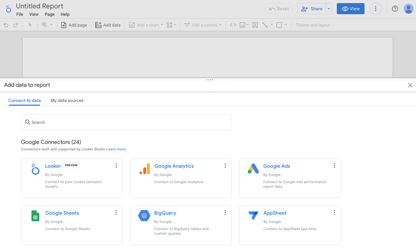
The Add data to report panel will load from the bottom of the page.
In the Google Connectors section, select BigQuery.
Authorize that "Looker Studio requires authorization to connect to your BigQuery projects."
If prompted, in the Sign in dialog, select your student account.
If prompted, click Allow to give Looker Studio permission to view the BigQuery resources in your lab account.
Select My Projects.
In the Project column, click your project name.
In the Dataset column, click demos.
In the Table column, click current_conditions.
Lastly click Add.
You will be prompted with a You are about to add data to this report notice.
Check Don't show me this again and click Add to report.
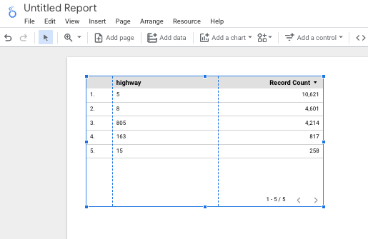
Once complete, a simple default tabular report appears. This confirms that you can see your BigQuery data in Looker Studio.
Note: Giving Looker Studio permission to Google Cloud account resources is typically a first-time activity and not something you would need to do every time you create a report.
Click Check my progress to verify the objective.
Creating a data source
Task 2. Creating a bar chart using a calculated field
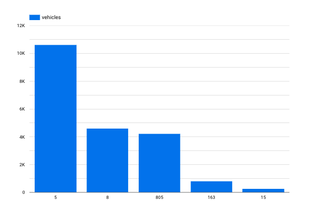
Once you have added the current_conditions data source to the report, the next step is to create a visualization. Begin by creating a bar chart. The bar chart will display the total number of vehicles captured for each highway.
(Optional) At the top of the page, click Untitled Report to change the report name. For example, type <PROJECTID>-report1-yourname.
Delete the pre-populated tabular report. You can do this by simply selecting it and pressing delete.
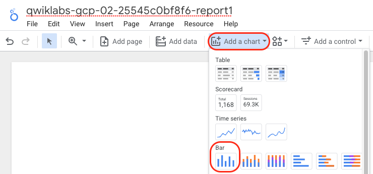
Next, from the Add a chart menu select the first Bar chart.
In the Bar chart properties window, on the Setup tab, notice the value for Data Source (current_conditions) and the default values for Dimension and Metric.
If Dimension is not set to highway, then change Dimension to highway. In the Dimension section, click the existing dimension and in the Dimension picker, select highway.
In the Metric section, click Add metric and add latitude.
In the Metric section, mouse over Record Count and click the (x) to remove it.
Example:
To gain insight on vehicle volume you need to add a metric for each vehicle detected.
In the Metric section, click Add metric and add sensorId.
A count distinct for this column is automatically created. This metric set as a count distinct does not give you a true sense of traffic volume. Click the CTD text next to sensor_Id and on the popup window choose Count . Type the name vehicles in the name box. Click in the report space off the popup to close it. The change is saved automatically.
In the Metric section, mouse over latitude and click the (x) to remove it.
The Dimension should be set to highway and the Metric should be set to sensorId. Notice the chart below is sorted in descending order by default. The highway with the most vehicles is displayed first.
To enhance the chart, change the bar labels. In the Chart properties window, click the STYLE tab.
In the Bar chart section, check Show data labels.
The total number of vehicles is displayed above each bar in the chart.
Task 3. Creating a chart using a custom query
You may find that it is easier to work with an existing query to produce the desired reports and visualizations in Looker Studio. The Custom Query option lets you leverage BigQuery's full query capabilities such as joins, unions, and analytical functions.
Alternatively, you can leverage BigQuery's full query capabilities by creating a view. A view is a virtual table defined by a SQL query. You can query data in a view by adding the dataset containing the view as a data source.
When you specify a SQL query as your BigQuery data source, the results of the query are in table format, which becomes the field definition (schema) for your data source. When you use a custom query as a data source, Looker Studio uses your SQL as an inner select statement for each generated query to BigQuery. For more information on custom queries in Looker Studio, consult the online help.
To add a bar chart to your report that uses a custom query data source:
From the Add a chart menu select the first Bar chart.
In the Bar chart properties window, on the Setup tab, notice the value for Data Source (current_conditions) and the default values for Dimension and Metric are the same as the previous chart. In the Data Source section, click the current_conditions data source. At the bottom of the pane choose Add data.
Under Google Connectors, select BigQuery.
Select CUSTOM QUERY in the first grouping.
For Billing Project, select your project.
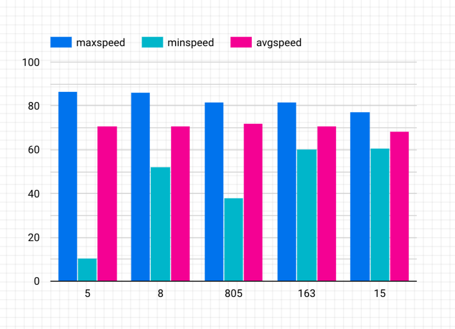
Type the following in the Enter custom query window and replace the <PROJECTID> with your Project ID:
SELECT max(speed) as maxspeed, min(speed) as minspeed,
avg(speed) as avgspeed, highway
FROM `<PROJECTID>.demos.current_conditions`
group by highway
This query uses max/min/avg functions to give you the corresponding speed for each highway.
Click ADD.
Note: Looker Studio may be unable to determine the appropriate Dimension and Metrics for the chart. This requires you to adjust the graph options.
In the Bar chart properties, on the Setup tab, in the Metric section, click Record count.
In the Metric picker, select maxspeed.
In the Metric section, click Add metric.
In the Metric picker, select minspeed.
In the Metric section, click Add metric.
In the Metric picker, select avgspeed.
Remove the metric other than maxspeed, minspeed and avgspeed, if exist.
Your chart now displays the maximum speed, minimum speed, and average speed for each highway.
Notice each bar has a default color based on the order the metrics were added to the chart.
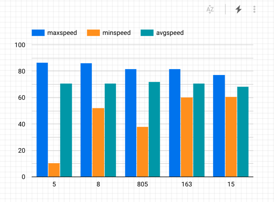
For readability, change the chart styles. In the Chart properties, click the Style tab.
In the Color By section, click on the boxes to select different colors.
Click Check my progress to verify the objective.
Create a chart using a custom query
Task 4. Viewing your query history
You can view queries submitted via the BigQuery Connector by examining your query history in the BigQuery web interface. Using the query history, you can estimate query costs, and you can save queries for use in other scenarios.
Open BigQuery Console
In the Google Cloud Console, select Navigation menu > BigQuery.
The Welcome to BigQuery in the Cloud Console message box opens. This message box provides a link to the quickstart guide and lists UI updates.
Click Done.
In the bottom panel the first item in the list will be Personal history. On your initial visit to the page the query history should appear on the bottom right underneath the Query editor pane. If it is not loaded click the Personal history link.
The list of queries is displayed with the most recent queries first. Click on any Query to view details on the query such as Job ID and Bytes Processed.
End your lab
When you have completed your lab, click End Lab. Google Cloud Skills Boost removes the resources you’ve used and cleans the account for you.
You will be given an opportunity to rate the lab experience. Select the applicable number of stars, type a comment, and then click Submit.
The number of stars indicates the following:
1 star = Very dissatisfied
2 stars = Dissatisfied
3 stars = Neutral
4 stars = Satisfied
5 stars = Very satisfied
You can close the dialog box if you don't want to provide feedback.
For feedback, suggestions, or corrections, please use the Support tab.
Copyright 2022 Google LLC All rights reserved. Google and the Google logo are trademarks of Google LLC. All other company and product names may be trademarks of the respective companies with which they are associated.
Les ateliers créent un projet Google Cloud et des ressources pour une durée déterminée.
Les ateliers doivent être effectués dans le délai imparti et ne peuvent pas être mis en pause. Si vous quittez l'atelier, vous devrez le recommencer depuis le début.
En haut à gauche de l'écran, cliquez sur Démarrer l'atelier pour commencer.
Utilisez la navigation privée
Copiez le nom d'utilisateur et le mot de passe fournis pour l'atelier
Cliquez sur Ouvrir la console en navigation privée
Connectez-vous à la console
Connectez-vous à l'aide des identifiants qui vous ont été attribués pour l'atelier. L'utilisation d'autres identifiants peut entraîner des erreurs ou des frais.
Acceptez les conditions d'utilisation et ignorez la page concernant les ressources de récupération des données.
Ne cliquez pas sur Terminer l'atelier, à moins que vous n'ayez terminé l'atelier ou que vous ne vouliez le recommencer, car cela effacera votre travail et supprimera le projet.
Ce contenu n'est pas disponible pour le moment
Nous vous préviendrons par e-mail lorsqu'il sera disponible
Parfait !
Nous vous contacterons par e-mail s'il devient disponible
Un atelier à la fois
Confirmez pour mettre fin à tous les ateliers existants et démarrer celui-ci
Utilisez la navigation privée pour effectuer l'atelier
Ouvrez une fenêtre de navigateur en mode navigation privée pour effectuer cet atelier. Vous éviterez ainsi les conflits entre votre compte personnel et le compte temporaire de participant, qui pourraient entraîner des frais supplémentaires facturés sur votre compte personnel.
Streaming Data Processing3: Streaming Analytics and Dashboards
Durée :
1 min de configuration
·
Accessible pendant 120 min
·
Terminé après 120 min