


准备工作
- 实验会创建一个 Google Cloud 项目和一些资源,供您使用限定的一段时间
- 实验有时间限制,并且没有暂停功能。如果您中途结束实验,则必须重新开始。
- 在屏幕左上角,点击开始实验即可开始
Use Formulas in Connected sheet
/ 20
Use Charts
/ 20
Use Pivot tables
/ 20
Using Extract
/ 20
Calculated columns
/ 20
Connected Sheets brings you the power and scale of a BigQuery data warehouse to the familiar context of Google Sheets. With Connected Sheets, you can analyze billions of rows and petabytes of data in Sheets without specialized knowledge of computer languages like SQL.
This makes it easy for anyone, not just data analysts, to apply pivot tables, charts, and formulas to massive datasets and hone in on their most valuable customers or product lines; develop forecasting models, uncover trends, and perform ad hoc analysis with ease.
In this lab, you:
Read these instructions. Labs are timed and you cannot pause them. The timer, which starts when you click Start Lab, shows how long Google Cloud resources are made available to you.
This hands-on lab lets you do the lab activities in a real cloud environment, not in a simulation or demo environment. It does so by giving you new, temporary credentials you use to sign in and access Google Cloud for the duration of the lab.
To complete this lab, you need:
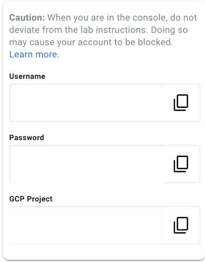
In a new incognito window, open the Google Sheets home page.
In the Google Sign in page, paste the username from the Connection Details panel, then copy and paste the password.
After a few moments, you will be at the Google Sheets home page.
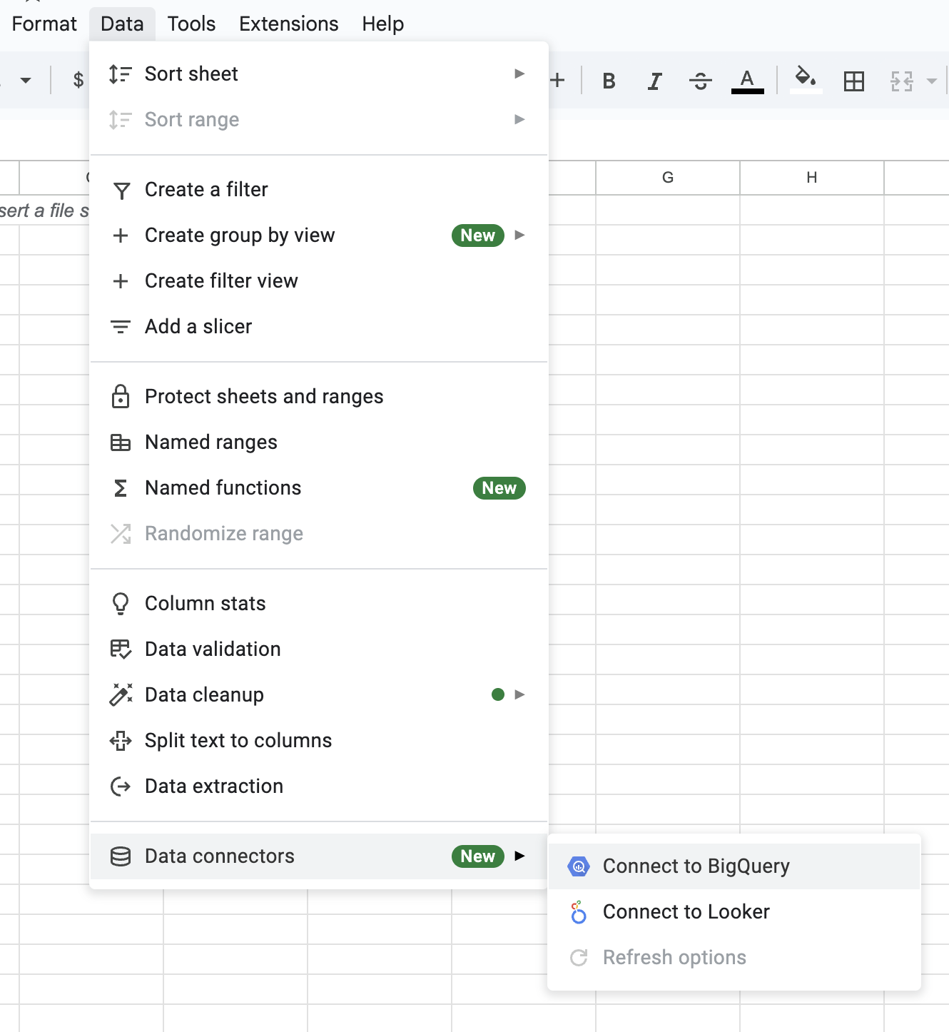
The data you will be analyzing will be taxi trips in Chicago. Start by connecting the public Chicago taxi dataset that's available in BigQuery to Google Sheets.
If you see a Connect and Analyze big data in Sheets pop-up, click Get Connected.
Select YOUR PROJECT ID > Public datasets > chicago_taxi_trips.
Select taxi_trips and click Connect.
After about a minute, you should see a success message. You have just connected a BigQuery dataset to Google Sheets!
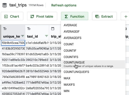
Next you will look at how to use Formulas with Connected Sheets. First, find out how many taxi companies there are in Chicago.
Ensure New Sheet is selected and click Create to add it to a new sheet.
Specify the company column by changing the value of your cell at row 1, column A to this:
Looks like there are 176 taxi companies in Chicago (your results may vary depending on the date the data is accessed).
Next, find the percentage of taxi rides in Chicago that included a tip.
COUNTIF function, find the total number of trips that included a tip. Copy and paste this function into the cell at row1, column D:Click Apply.
Now, use the COUNTIF function to find the total number of trips where the fare was greater than 0. Add this function into the cell at row1, column E:
Click Check my progress to verify the objective.
Turns out around 38.6% of taxi trips in Chicago included a tip (your results may vary depending on the date the data is accessed).
What forms of payments are people using for their taxi rides? How has revenue from mobile payments changed over time?
Try viewing this information with Charts.
Return to the taxi_trips tab by clicking on it at the bottom of your Google Sheets page.
Click on the Chart button. Ensure New Sheet is selected and click Create.
In the Chart editor window, under Chart type, select Pie chart.
Various columns of the data are listed to the right. Drag payment_type to the Label field. Then drag fare into the Value field and click Apply.
The value of Cash payments slightly edges out the value of Credit Card payments.
Under Value > Fare, change Sum to Count. Click Apply.
Now, the Cash transactions significantly outnumber Credit Card transactions, implying that the latter has a higher average value.
Next, find out how mobile payments have changed over time by using a line chart.
Return to the taxi_trips tab by selecting it at the bottom of your Google Sheets page.
Select the Chart button. Ensure New Sheet is selected and click Create.
Click on the Chart Type dropdown and select the first option under Line.
Drag trip_start_timestamp to the X-axis field.
Check the Group by option and select Year-Month from the dropdown list.
Drag fare into the Series field.
Click Apply.
The overall revenue peaked in 2015. But, how have mobile payments changed over time?
Under Filter click Add > payment_type.
Select the Showing all items status dropdown.
Click on the Filter by Condition dropdown and select Text contains from the list.
Input mobile in the Value field.
Click OK.
Click Apply to generate a new line chart.
From the chart, you should see that mobile payments have been on a general upward trend. What other observations can you make from the graph?
Click Check my progress to verify the objective.
At which time of day are there the highest amount of taxi rides? In the following section, you will analyze this using pivot tables.
Return to the taxi_trips tab by selecting it at the bottom of your Google Sheets page.
Click on the Pivot table button.
Ensure New sheet is selected and click Create.
Drag trip_start_timestamp into the Rows field.
Choose Hour for the Group By option.
Drag fare into the Values field.
Select COUNTA for the Summarize by option.
Click Apply.
You should now see a table that lists the number of rides per hour of the day (military time).
At which time of day do you see the most taxi rides?
Next, break it down by day of the week.
Drag trip_start_timestamp to the Columns field.
Select Day of the week under the Group by option.
Click Apply.
Select the data range B3:H26 and select Format > Number > Number.
Click on the decrease decimal place button twice to make the data easier to read.
Now, apply some conditional formatting.
Select all your data cells by clicking on the top left cell (first value for Sunday) and then shift + clicking on the bottom right cell (last value for Saturday).
With all your cells selected, click Format > Conditional formatting.
Select Color scale.
Select the colors under Preview and choose White to Green. This will make the high values green and the low values white.
Click Done.
Close the Conditional Formatting window by clicking the x.
Now, observe that peak periods on weekends are in the early morning and peak periods on weekdays are around the start and end of typical office hours.
What about the most expensive times for taxis?
Turns out that Monday early morning taxi fares are the most expensive!
Feel free to explore other combinations of data using pivot table and see what other insights you can uncover!
Click Check my progress to verify the objective.
Sometimes, you may find that you are only working with a small subset of the dataset. You may also want to take a closer look at the raw data itself. In such cases you might find it easier to import a subset of the dataset from BigQuery into Connected Sheets.
By default, Connected Sheets shows a preview of 500 rows of raw data in BigQuery. To import more data into Connected Sheets, you can use Extract.
For this example you will extract 25000 rows of data from the columns trip_start_timestamp, fare, tips, and tolls, ordered by latest trip first.
Return to the taxi_trips tab by selecting it at the bottom of your Google Sheets page.
Click on the Extract button.
Ensure New sheet is selected and click Create.
In the Extract editor window, click Edit under the Columns section and select the columns trip_start_timestamp, fare, tips, and tolls. Click outside the dropdown box to continue.
Click Add under the Sort section and select trip_start_timestamp. Click on Desc to toggle between ascending and descending order.
Under Row limit, leave 25000 as it is to import 25000 rows.
Click Apply.
That's it! You have just extracted thousands of rows of raw data from BigQuery into Connected Sheets!
Click Check my progress to verify the objective.
Calculated columns allows you to add new columns that are transformations or combinations of existing columns. You will create a calculated column that calculates tip percentage.
On the right you can see the columns of your dataset and the functions available. You can also click on the question mark in the description to see examples of calculated columns.
tip_percentage into the Calculated column name field.Click Add.
Click Apply.
Now you can see the percentage of the fare that was tipped under the tip_percentage column.
Click Check my progress to verify the objective.
By default, all the analyses that you do on Connected Sheets remain unchanged until you decide to refresh it. This means that even if the data in BigQuery changes, your charts and tables will not change unexpectedly.
Now you'll see how you can update your analyses to the latest data, or schedule regular updates.
You can also click the Refresh options button, located beside the name of your dataset, followed by Refresh all to update all Connected Sheets analyzes to the latest data.
To schedule a refresh, click on Schedule refresh near the bottom of the Refresh options sidebar.
Finally, choose your desired frequency and time for the automatic data refreshes.
Click Save.
You have learned how to:
Feel free to explore even more functions of Connected Sheets on your own. Happy analysing!
...helps you make the most of Google Cloud technologies. Our classes include technical skills and best practices to help you get up to speed quickly and continue your learning journey. We offer fundamental to advanced level training, with on-demand, live, and virtual options to suit your busy schedule. Certifications help you validate and prove your skill and expertise in Google Cloud technologies.
Manual Last Updated May 27, 2024
Lab Last Tested May 27, 2025
Copyright 2025 Google LLC. All rights reserved. Google and the Google logo are trademarks of Google LLC. All other company and product names may be trademarks of the respective companies with which they are associated.


此内容目前不可用
一旦可用,我们会通过电子邮件告知您

太好了!
一旦可用,我们会通过电子邮件告知您

一次一个实验
确认结束所有现有实验并开始此实验