Before you begin
- Labs create a Google Cloud project and resources for a fixed time
- Labs have a time limit and no pause feature. If you end the lab, you'll have to restart from the beginning.
- On the top left of your screen, click Start lab to begin
Stage your Google Sheets workbook
/ 10
Use the Extract editor to sort the remaining data
/ 10
Create a calculated field to highlight only the needed geo_id data
/ 10
Referencing the answer data in another sheet
/ 10
Create a column chart using reference data
/ 20
Modify the column chart formatting
/ 20
Configuring sheet sharing parameters in Google Sheets
/ 20
In this scenario, you are a data analyst with strong experience in Google Sheets but are new to BigQuery. You are employed with a solar energy company who is interested in identifying U.S. counties with the highest number of homeowners who can benefit from a new grant. The new United States (U.S.) federal grant is available to homeowners with homes built before 1960 and annual incomes below $60,000 USD. You know that the necessary data to identify these homeowners is in your company's BigQuery data warehouse and would like to analyze the BigQuery data in Google Sheets.
Fortunately, through the BigQuery data connector in Google Sheets, Connected Sheets provides you with the ability to access, analyze, visualize, and share BigQuery data without the need for any SQL.
In this lab, you learn how to get started with BigQuery data in Google Sheets by extracting and filtering BigQuery data in Connected Sheets.
In this lab, you will learn how to perform the following tasks:
In order to complete this lab exercise, you must have previous knowledge with and experience performing the following tasks:
For each lab, you get a new Google Cloud project and set of resources for a fixed time at no cost.
Sign in to Qwiklabs using an incognito window.
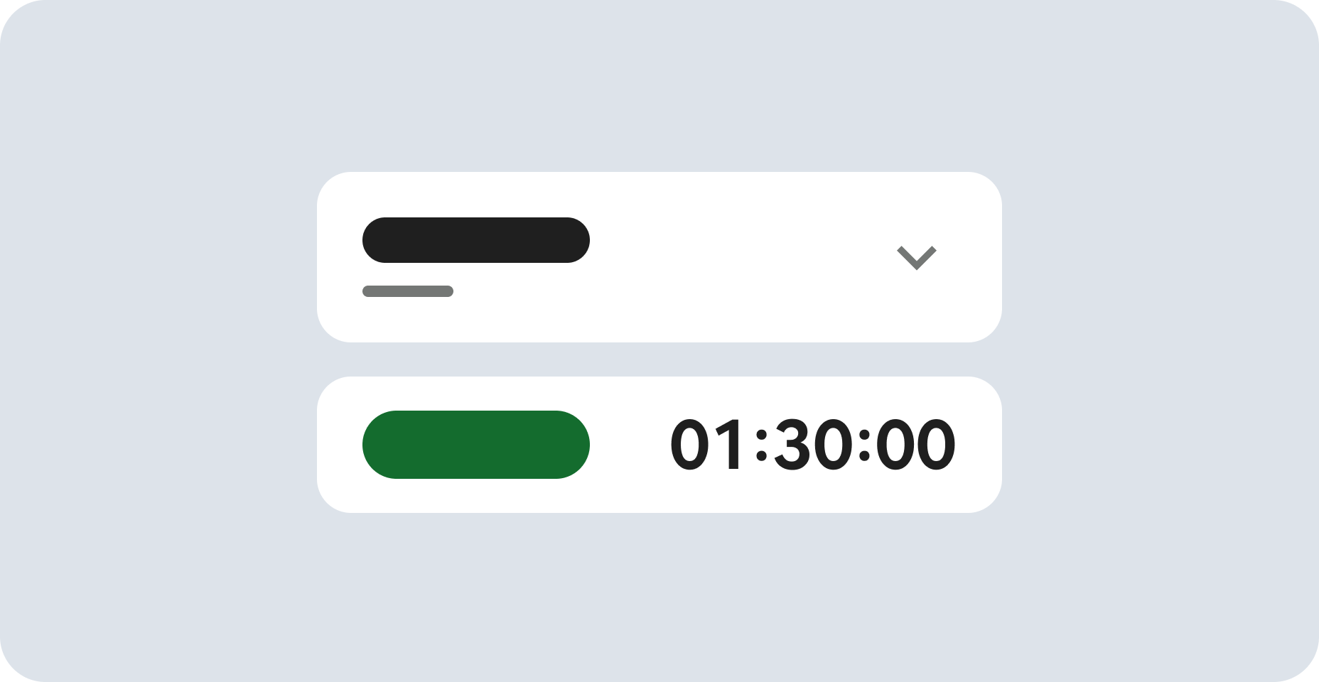
Note the lab's access time (for example, 1:15:00), and make sure you can finish within that time.
There is no pause feature. You can restart if needed, but you have to start at the beginning.
When ready, click Start lab.
Note your lab credentials (Username and Password). You will use them to sign in to the Google Cloud Console.
Click Open Google Console.
Click Use another account and copy/paste credentials for this lab into the prompts.
If you use other credentials, you'll receive errors or incur charges.
Accept the terms and skip the recovery resource page.
You must properly stage your sheet before you can complete the tasks in this lab exercise. To begin, please perform the following steps:
Use BigQuery Connected Sheets to locate the censustract2018_5yr_top10000_housingunits data table, contained within the
Use BigQuery Connected Sheets to download the censustract2018_5yr_top10000_housingunits data table into Google Sheets.
Create a data extract using the BigQuery Connected Sheets interface.
Use the Extract editor to select the four most useful data columns needed for the data analysis:
Use the Extract editor to select and configure the two most useful column filter criteria:
Click Check my progress to verify the objective.
Click Check my progress to verify the objective.
Click Check my progress to verify the objective.
Click Check my progress to verify the objective.
At this point in the process, the data has already been pulled from BigQuery into Google Sheets, a data extraction has been created using only the most relevant columns, and the actual data analysis steps have been taken. All that is left to do is to visualize the answer data by creating a chart, and then share the sheet with others. We will focus on the first task now.
In this task, you create a column chart specifically using previously identified reference data.
In the Reference data tab, select columns B and C to highlight their data for use in the new chart.
From the Insert option in the Google Sheets menu bar, click the Chart option.
In the Setup section of the Chart editor, choose the Column chart option if not already selected.
Leave the Chart editor open, and proceed to the next task.
Click Check my progress to verify the objective.
Google Sheets provides many different methods for adjusting and refining the presentation of charts. From color schemes, to font choices to layouts and more, you can adjust your chart to display the clearest interpretation of the story your data tells. Customizing column charts in Google Sheets
In this task, you change the global font for your chart, its color scheme and then move the chart to its own tab within the workbook.
In the Customize section of the Chart editor, expand the Chart style section, and choose the Roboto font from the Font drop-down menu.
Expand the Series section, and click on the Fill color drop-down menu, then select a color of your choice. WCAG 3.0 recommended accessibility guidelines
Click on the Opacity drop-down menu and select a value of 90%.
Proceed to the next task.
Click Check my progress to verify the objective.
Google Workspace provides a lightweight but powerful way to share and collaborate on your sheets, docs, slides and more with others. These controls also ensure that you provide them with only what they need to see and strict enforcement on how much they can interact or modify that content. Sharing workbooks
In this task, you configure the sharing options for this workbook and share it with yourself.
Replace the Untitled spreadsheet default title in the upper left-hand corner of the screen with a title of your own choosing.
Click on the Share button in the top right-hand side of the workbook.
Add a sample email address to the email address bar.
Click on the role permissions drop-down menu next to the selected email address and choose the Editor role.
Enter a short message explaining to the person with whom you are sharing this workbook what this data is in order to provide them some frame of reference for why you are choosing to share this with them.
Click Check my progress to verify the objective.
You have successfully created and modified a column chart and shared a workbook with someone.
When you have completed your lab, click End Lab. Qwiklabs removes the resources you’ve used and cleans the account for you.
You will be given an opportunity to rate the lab experience. Select the applicable number of stars, type a comment, and then click Submit.
The number of stars indicates the following:
You can close the dialog box if you don't want to provide feedback.
For feedback, suggestions, or corrections, please use the Support tab.
Last Tested Date September 23, 2024
Last Updated Date September 23, 2024
Copyright 2022 Google LLC All rights reserved. Google and the Google logo are trademarks of Google LLC. All other company and product names may be trademarks of the respective companies with which they are associated.
This content is not currently available
We will notify you via email when it becomes available
Great!
We will contact you via email if it becomes available
One lab at a time
Confirm to end all existing labs and start this one

